
SFF ART BOOK
(ABOUT PROJECT)
(DETAILS)
PURPOSE
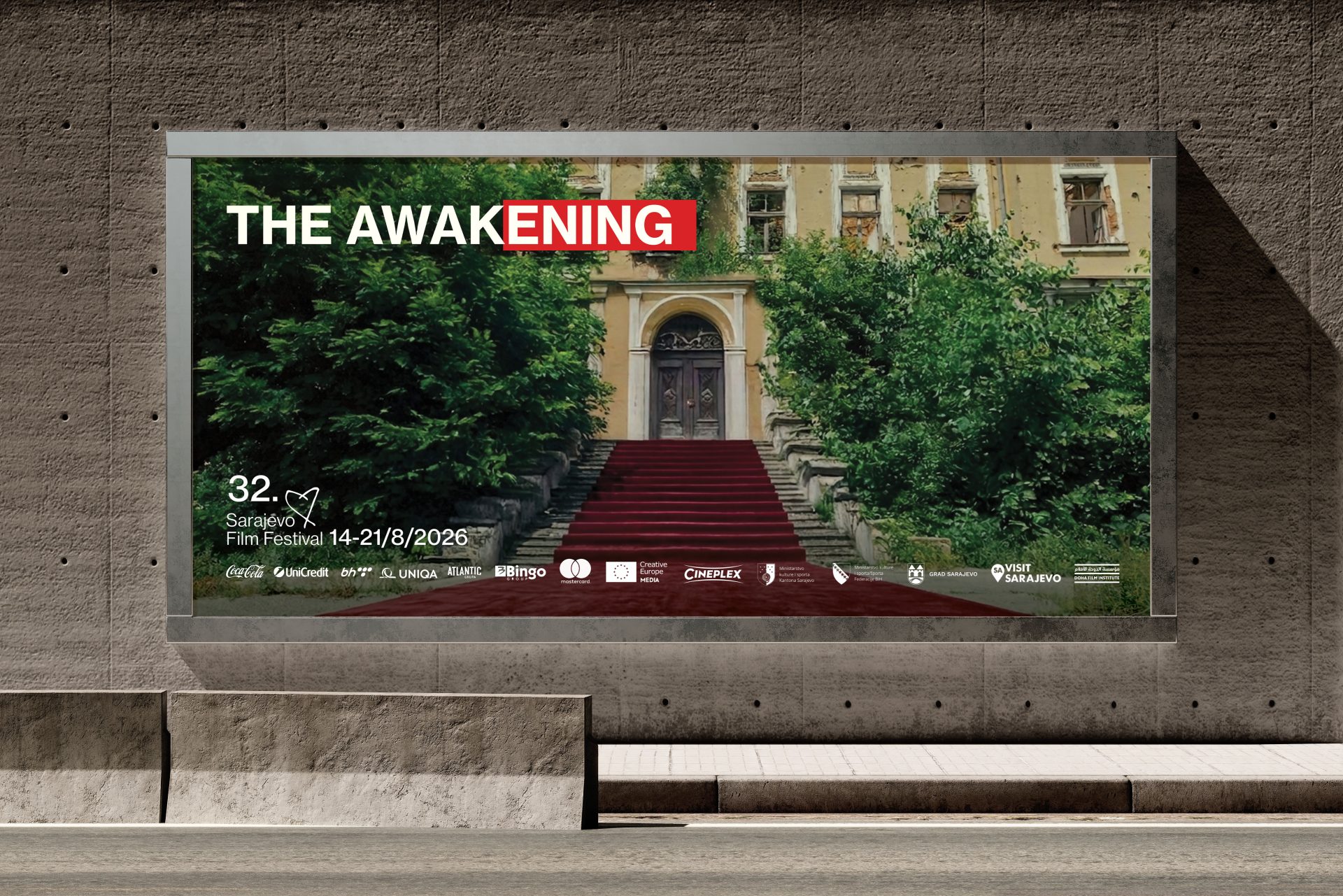
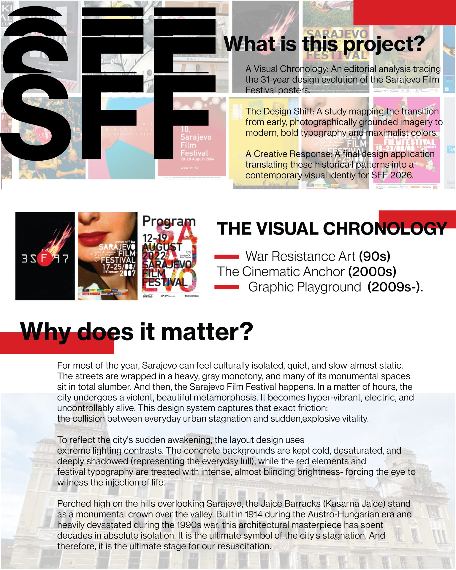
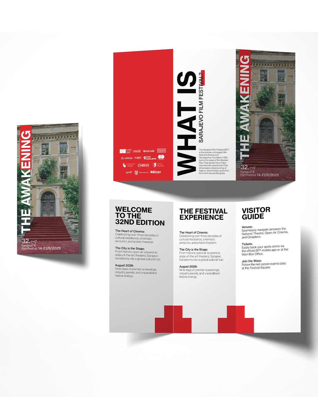
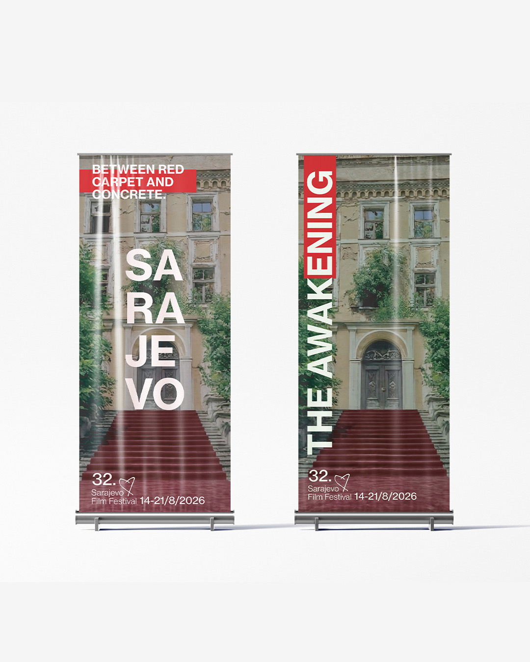
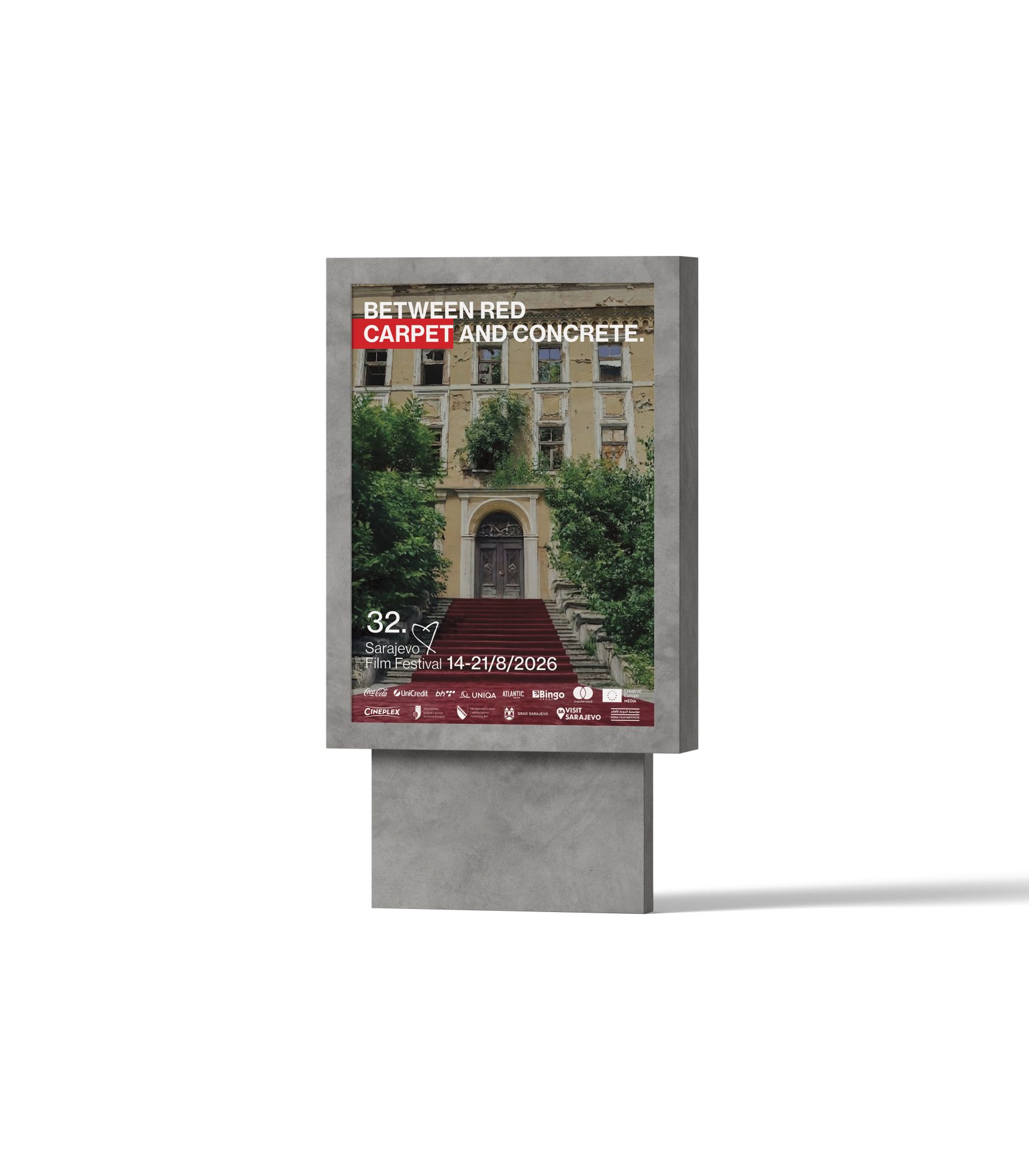
SFF posters are not just advertisements - they reflect the cultural and psychological rebirth of Sarajevo from a city of resistance to a global cultural capital. The Cinematic Anchor (2000s) Graphic Playground (2009s-). Understanding how the SFF Red and the Heart symbols evolved allows us to push design boundaries today without losing the festival's soul.By analyzing the past, this project creates a visual bridge, proving that typography and color can carry a legacy just as powerfully as a photograph.
ABOUT CONCEPT
This project is an editorial analysis tracing the 31-year design evolution of the Sarajevo Film Festival posters. A study mapping the transition from early, photographically grounded imagery to modern, bold typography and maximalist colors.
(WHY)
(GALLERY)

LET’S
WORK
CONTACTWORK